

We all had different ideas for what we wanted for the digipak and decided to draw them out and see how they work. As we interviewed different members of our 16-24 year old target audience, we adapted some of our ideas in relation to what they said.
Here are our designs:
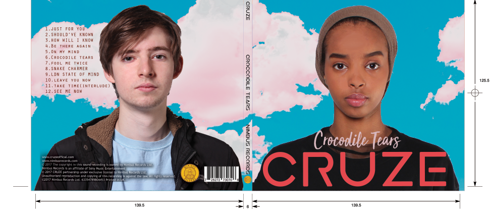
These are some of the initial designs that we had for our album cover. We initially intended for both artists to feature on the front cover, with props and a mid shot.


From our target audience feedback we found out that many liked the idea of having a central close-up of our female artist as the focal image was great for a debut album. Similar to the likes of Adele and Kali Uchis.

After sharing our ideas and looking at real digipaks we saw some overarching themes and decided to focus on those. Here are some of those ideas:
- One central close up of the artist on the front panels.
- Cloud like background
- Light colours
- Large artist name
- Smaller font for the album/song name
- Tracklist on the back
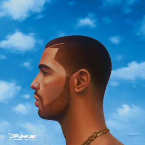
Here are some of the albums and singles we looked at for inspiration:


No comments:
Post a Comment