

The website is very useful and important as it is a way of marketing the artist and their work, it also creates a platform where the fans can engage further with the artist by buying things such as merchandise, getting the artists contact details and reading more about the artists' history. We also conducted audience research to see what our target audience expected of a webpage from an artist that appeals to them.

As a group we designed the menu bar for the website which includes the band logo in the middle and various links throughout. This menu bar will be seen on every page so we wanted to ensure that it contains links to the important pages. Here are the different pages:
- Home: The first page that is seen when clicking on to the website, all of the information is here. The most current music video will also be featured here.
- Music: Where the consumer will be able to purchase the album and individual songs, both physically and digital downloads. There will also be an insight into the songwriting process and the inspiration of songs. Music videos will also be featured here and new songs will be teased.
- Tour: Location and dates for tours are featured here also the consumer will be able to buy tickets through other websites.
- About: Gives personal information about the artists and their background.
- Shop: The consumer will be able to buy the artists merchandise such as T-Shirts, jumpers and posters.
- More: More will contain the gallery, social media contacts of the artist & label and news about the artist and label.
We conducted research on similar artists and their websites. Although all the websites are different there are some key conventions that run through all of them such as a large focal image, a menu bar that runs along the top, behind the scenes footage and promotional shots.
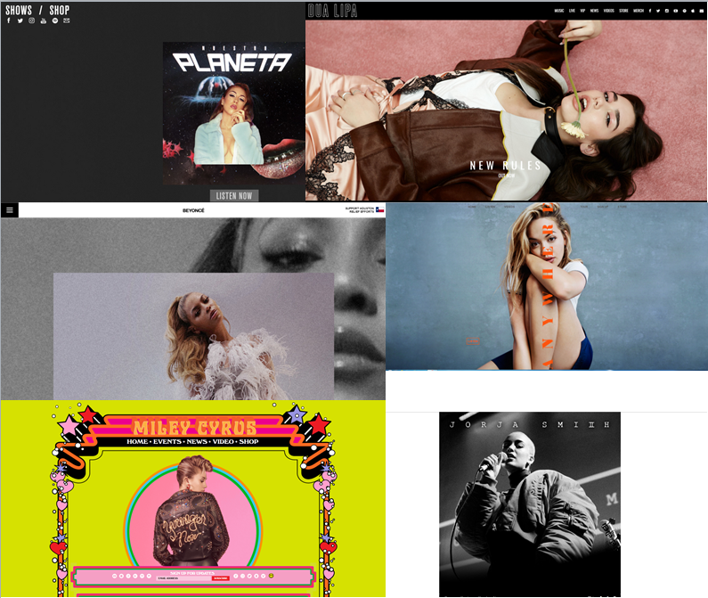 |
| Here are some of the examples that we looked at. |
 |

No comments:
Post a Comment