Below is our Music Video:


Below are the front panels of our digipak:

Below are the outside panels to our digipak.

Below are the outside panels to our digipak.

Below are the inside panels to our digipak.

Below are the inside panels to our digipak.

Click on the image below to access our website.

Friday 5 January 2018

Evaluation Question 1: In what ways does your media product use, develop or challenge forms and conventions of real media products?

Our three media products: the music video, album and website all use, develop and challenge the existing forms and conventions of real-life media products in the music industry. We adhered to forms and conventions of existing media products in the music industry to ensure that there was always a place in the market for our media products as they all looked very realistic. We challenged some conventions such as the sexualisation of females that is heavily prevalent in the genre as we felt this would make our products unique and more appealing to our target audience.


Frith’s Theory

When planning our music video it was important that we made sure our ideas were influenced by different theories. Frith’s theory of music video where he classifies what the major types of music videos are was very useful as it allowed us to distinguish the overall form we wanted our video to take from an early stage.


Music Video

Here are some of the forms and conventions of music videos:


The relationship between the lyrics, music and visuals

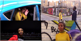
The first two aspects of Goodwin's theory is that there is a clear relationship between the lyrics, music and the visuals. The visuals are often used to support or contradict the lyrics/music.

In our music video there is a relatively clear relationship between the lyrics and the visuals.

Here are some examples:

gifs website
Here the actions of being in the phone and the miming mirror the line "You again, why'd you call? I don't need to hear you cryin' out my name"
gifs website
Here there is a circling hand gesture and the editing creates a 'ghosting effect' which further illustrates the torment in her mind and matches the lyric ".. frame of my mind"

gifs website
As the music gets faster here, the action is made to look faster through the "ghosting effect" editing style.

gifs website
Here the characters turn away from each other to represent the breakdown of their relationship.

 Genre Characteristics

1. Shows off the artist(s)
2. Represents the artist(s) positively
3. Represents the genre clearly
4. Bright colours
5. Fast cuts that synchronize with the track
6. Wide range of shot types used in quick succession.

Intertextual References

Rather than referencing any specific movements or moments in popular culture, we decided to make reference the vintage sportswear styles of the 90s and early 00s. We felt it would make our artist more appealing as they would be paying homage to their earlier years and give them a unique quality which their fans would remember them by.


The notion of looking & voyeurism

Goodwin often talks about voyeurism and especially how females are sexualised in music videos. There are some voyeuristic aspects of our music video and a nothing of looking but it subverts common conventions by being empowering rather than sexual.


In the video the artist looks at the camera most of the time but her scenes with her (ex)boyfriend she looks away from the camera. We did this deliberately to show her inner strength and the fact that she doesn't need a man to constantly support her and be by her side as she has strength in her own voice. 


The record label's demands must be met

As we created an artist and record label we didn't have any official demands from a label but we followed the conventions of similar artists and labels. These conventions were: beauty shots (close up shots of the artist that would really sell their image), shots of the artist performing to further push and sell their artistry and shots of the artists' clothing as this would help with brand deals and again sell the image that the artist intended to convey.


The "sporty-vintage" clothing in our music video is in line with the conventions of the genre. This consisted of Nike trainers, puffer jackets and bright colours. A record label would want to promote an artists image and their relationships with brands by them seen endorsing products in videos such as Nike.
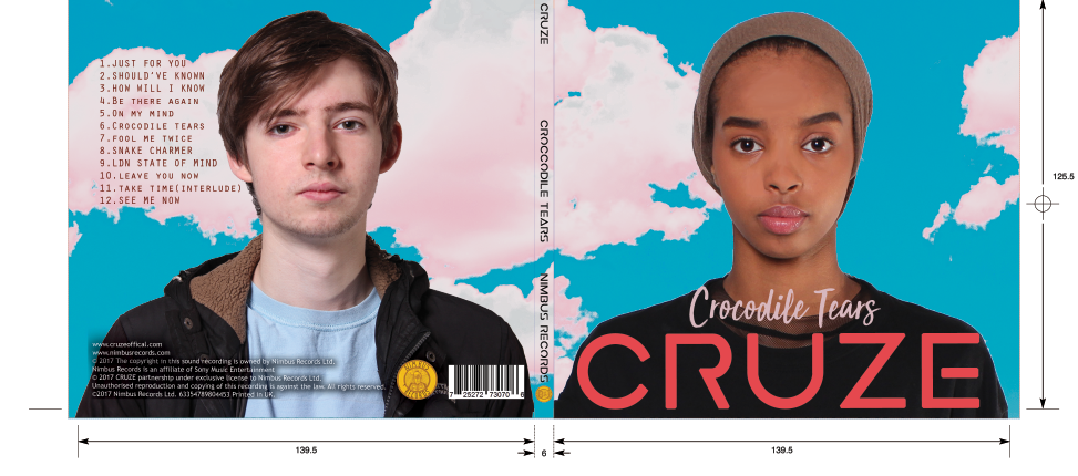
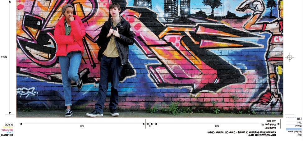


Digipak

For the digipak, we did conform to the typical conventions of other album covers, both in general and, more importantly, existing albums of the garage/RnB genre. We felt it was useful to conform to some of the conventions as some are needed to allow our digipak to easily be identified as an album cover and to ensure we included all of the institutional information that was expected. Such as the record label, a main focal image and institutional information. Using all of this allowed our digipak to look professional and realistic.

I have created a slideshow to explore the conventions of album covers and how we have adhered to them or subverted them:


Website

On the whole, we adhered to the conventions of websites as we wanted to make sure it looked professional and realistic. Here is a slideshow of the conventions of the website:


Conclusion

In conclusion, the 3 different media products we created all use, develop and challenge their own forms and conventions. We felt it was useful to adhere to conventions as we felt that it made our media products look more realistic and professional. We challenged some conventions as we felt it made our products look more unique and have a greater appeal.

Evaluation Question 2: How effective is the combination of your main product and ancillary texts?

Our aim was to create three products: the music video - the main product and two ancillary products (website and digipak). We wanted to make sure our products worked efficiently and effectively together to help promote our artists image. This would be ensured through a successful marketing campaign that reaches and appeals to the audience. The role of marketing is to persuade audiences to spend their money, so each product promotes each other synergistically .

Various marketing methods are used to create awareness for campaigns and in turn generate revenue. These are some of the marketing methods:


A promotional campaign usually starts with a single, then a music video is released to promote this singles (similar to what we did with the video for "On My Mind"). After the music video, the album is released (our artist released the album Crocodile Tears), this album is then followed by a tour which songs from the album will be performed. Tours are very important for the artist and record label as that is now where they make the majority of their revenue as over the last few years there has been a shift in the monetary value of the album.

Mark Mulligan made a graph to show the shift of the measurements of success for a new generation of digital age artists:


Over recent years as the price of tour tickets has increased to meet the "bottom line" demands of record labels, the production and scale of tours has also increased. For example:

Image result for drake boy meets world tour
Drake's Boy Meets World Tour

Image result for beyonce formation tour
Beyonce's Formation Tour
Working with brands is also a huge part of the promotional campaign as the symbiotic relationship is mutually beneficial, whether it be "above the  line" or "below the line".
Some of our "above the line" promotion:


"Below the line" promotion:


Over the process we were inspired by many various real life marketing campaigns, these various campaigns influenced our ideas. I will now compare our marketing campaign to AlunaGeorge's marketing campaign:


Here is our marketing campaign:


Richard Dyer Star Theory


Conclusion

In conclusion, I feel that we have created a very successful combination of products in our marketing campaign that all work together to make a realistic and relevant artist.The main product, the video, and the two ancillary products, the website and digipak all work synergistically to create a realistic artist that will reach a wide audience and appeal to our core target audience of 16-24 year old RnB fans. I feel that we correctly utilised Richard Dyer's star theory to create an image that many will relate to and aspire to be. This will make sure that "CRUZE" have a significant impact on popular culture and, possibly, the ability to transcend their music and become pop stars.

Evaluation Question 3: What have you learnt from your audience feedback?

Audience feedback was very useful throughout all of the stages of the process as it allowed us to ensure our ideas would reach a wide audience and appeal to the specific audience that we had intended. Here is our audience:

Click to enlarge

Primary target audience:

16-24 year old young adults (both genders) who are fans of pop and RnB.


Image result for 16-24 year olds
Our primary audience are fans of the RnB genre aged 16-24

Secondary target audience:

Our secondary audience were British teens that could relate/aspire towards our artist.

[USES & GRATS]

Here are some of the data results that we had from the pre production stage:


AFTER THE RELEASE OF THE MEDIA PRODUCTS

After the music video was released we interviewed some of our target audience on Survey Monkey. Below is the analysis that Survey Monkey provided:

What would you improve
Favourite genre
Which shots were your
favourites

Would you listen to more of
this artist
How many stars would you give this
artist

Evaluation Question 4: How did you use new media technologies in the construction, research, planning and evaluation pages?

To allow a smooth and successful transition throughout the process of research, constructing and evaluating our media products, we have used a lot of vital new media technologies. We were able to utilise the technological convergence of the tools at all three stages. New technologies were extremely useful during the product as they allowed us to get tasks done easily and more efficiently. I also personally enjoyed working with the

New Media Technologies helped a lot in the Evaluation stage of the project as it allowed me to have the tools to display the media product that I have created and the process that led to it. This New Media Technology includes: Microsoft Word, Youtube, Prezi, Blogger, Slides and emaze.


The rapid proliferation of mobile technology has led to advancements in software making work much easier.


Below is the hardware software that we used:


Post-Production

Below is a prezi on the pros and cons of the technology we used in post-production. 


Although I am really pleased with how much technology has helped us over the course of the project, I also appreciate the "old school" methods such as sstoryboards and  timelines as they allowed us to plan out how we want our video to look like.

Thursday 21 December 2017

Construction Post 6: Website Post-Production

What we had to do:

Create a fully functional website for our artists.

Overall I am very happy with the final outcome of the website. I think we achieved exactly what we set out to and I feel it looks very professional and realistic. The Wix software was very convenient as it allowed us to edit the website without any prior knowledge of html or other programming languages.

What we wanted for our website
  • Lots of interactive opportunities
  • An online store
  • Artist information
My contribution to the website
  • I set up some of the tour page.
  • Edited a lot of the record label contact page and artist information page (About Me)
  • I also helped to decide the content for the shop.
  • I also made the opportunites to interact with the artists in the form of the competions page
Audience Feedback

We to some members of our target audience to get their opinions of our website.
  • They loved the large focal images of the artists on the various pages.
  • They also liked the social media links, navigation bar and choice of pages. They felt everything felt very fluid and easily accessible similar to a real artist page. One thing they did say was that some of the links on some pages incorrectly redirected them. We fixed this by ensuring all links were working correctly.
  • They also felt that although the pages were nice they could be more interactive, for example the "Info" page. We remedied this by adding a more interactive Q&A with "hover-to-reveal" answers.
  • Teachers also said they liked the pages but we could use more brand links that would be suitable, we responded to this by adding a Beats tie-in competition, references to TV & radio appearances and a Nike collaboration.

Some of the problems we faced were:
  • When setting us social media links, due to some inactivity in the accounts. We got suspended from twitter which meant that none of our twitter links were working. We managed to get around this by creating a new account and making sure to satisfy twitters terms and conditions.
  • The content within the header was inconsistent on various pages meaning traversing the website was very disorientating. We were able to overcome this by creating one main header that we anted to run throughout the pages of the website and then making sure every page that was possible to visit was consistent with this ideal header.

Construction Post 5: Digipak Post-Production

What we had to do:

Complete the Digipak

With the other members of my group having less experience with Photoshop prior to this task, I took a lead role in the production of the Digipak. This included: sourcing the background image, recolouring the background image, cropping and spot healing the artists.

Overall I am extremely pleased with the final outcome of the Digipak and I feel we achieved what we set out to achieve.

What we wanted for our album cover:
  • A creative and fun design to match the fun and care free genre of House/R&B
  • Really clear mid shots of our do for the front and back panel
  • Details: spine information, tracklist, record label, copyright information
Audience Feedback

The first step I took when constructing the digipak was deciding the two images we were going to use for our front and back cover as well as the background images. After choosing them we decided to show them to a small focus group to see what they thought about the images.
Here are the images:

Picture 1 - Front cover
Focus Group Response: They felt that due to the lack of symmetry in the neck line of the photo, despite how minor it may seem, it could draw attention away from the eyes.

Teacher Response: They also agreed that we needed to change the picture as the wonky collar looked awkward.

My Response: I responded to the feedback by using a different picture of Aisha that had a symmetrical neckline.


Picture 2 - Back cover

Focus Group Response: They ought the picture was good but it would need spot healing and need to look brighter.

Teacher Response: They thought it looked fine, we would just need to use the spot healing tool.

My Response: I responded to the feedback by using the spot healing tool on ray and using the skin smoother to make his skin tone brighter.


Picture 3 - Background image
Focus Group Response: Our focus group all thought the background was good.

Teacher Response: They thought the background was good and agreed with our suggestion of possibly changing the colours to make it look unique.

My Response: I responded to the feedback by changing the colour of the clouds and also adding a few more clouds myself using the close stamp and lasso tool.


Here is the finished product:


Album cover outside
Album cover inside

Construction Post 4: Music Video Post-production

What we had to do:

Edit the video using Adobe Premiere Pro.

The menu we used
I have experience using Premiere Pro from previous years of media so I felt that I was at ease using the software and trying to create something professional looking. We used multi track editing to easily edit various parts of the video. We found the software very useful as we using a workspace setting that made it easy to accesses our rushes and to pick the video we wanted to edit into our music video. The procamp tool and other colour correction were very useful in allowing us to grade the video and achieve a very professional finish to our edited video, it also allowed us to create the aesthetic that usually acompaines this style of music video.

My contribution to the edit


  • I placed a lot of the clips and tried to gauge the general feel of the video.
  • I was able to go over some of the edits the other members of my groups made and tighten cuts and improve the overall feel.
  • I graded some of the video.
  • I added some effects such as the montage at the end and some of the 'ghosting' shots.
Here is an example of some of the shots that were graded. Before and after
A challenge we faced was our video being too repetitive at times. We showed an early cut of our video to our target audience and were told it was good but repetitive and this in turn drew away from some of the postive factors of the video but we overcame this by replacing shots and trying to change the pace of the video as it progressed.

Here I am editing the video
Reflection on Audience Feedback

Overall, we received extremely positive feedback. The fan favourites included the peach coloured handheld shots and the siren beauty shots. I'm pleased with these as I worked the camera in both of these shots and set the colour for the background. People didn't have many criticisms but some thought that maybe the DJ should have been limited to just the studio shots as they felt it looked slightly awkward in the shots on location. This did not come as a surprise as we had already decided to cut some shots as they looked unnatural or forced.

We also recieved feedback from our teachers who felt that some of our extras looked unnatural and awkward, this in turn would detract from the rest of the video. We managed to remedy this by getting rid of the footage that seemed far too unnatural, we recorded the song the whole way from from all the different camera angles and setups that we had so we had a plethora of footage to replace this with.

Here is the finished product: